Icons
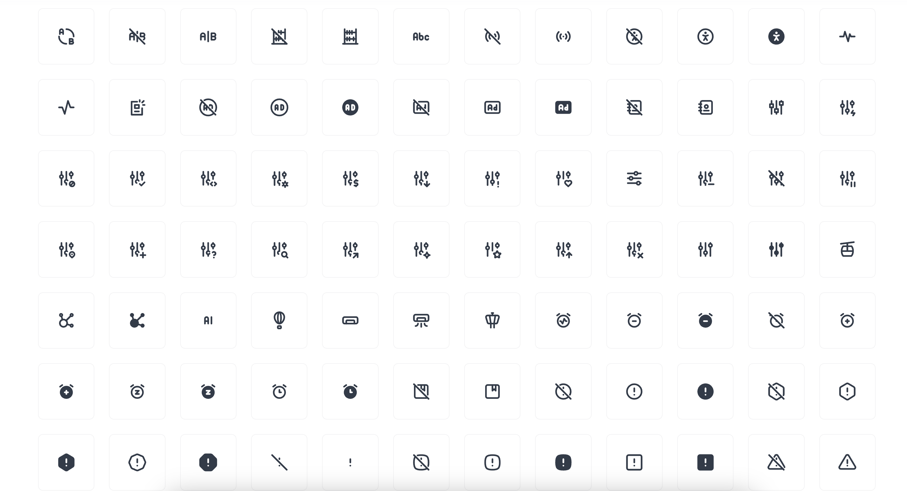
Introduction
Botble CMS uses Tabler Icons as its primary icon system. Tabler Icons is a free and open-source SVG icon library with over 4,200 pixel-perfect icons. The icons are implemented as SVG files, which provides several advantages:
- Scalable without loss of quality
- Customizable with CSS (color, size, etc.)
- Lightweight and optimized for performance
- Accessible and screen reader friendly
The icon system in Botble CMS is implemented in the platform/core/icon package, which provides a flexible and easy-to-use API for rendering icons throughout the application.
Architecture
The icon system consists of several components:
- IconManager: The main class that manages icon drivers and configuration.
- SvgDriver: The default driver that handles SVG icons from Tabler Icons.
- Icon Component: A Blade component for rendering icons in templates.
- Helper Methods: Convenience methods for rendering icons in PHP code.
Basic Usage
Using Blade Component
The most common way to use icons is with the Blade component:
<x-core::icon name="ti ti-user-heart" />You can also specify a size and additional attributes:
<x-core::icon
    name="ti ti-user-heart"
    size="lg"
    class="text-primary"
    data-bs-toggle="tooltip"
    title="User Profile"
/>
Using Helper Method
You can also use the BaseHelper::renderIcon() method in PHP code:
use Botble\Base\Facades\BaseHelper;

// Basic usage
BaseHelper::renderIcon('ti ti-user-heart');

// With size
BaseHelper::renderIcon('ti ti-user-heart', 'lg');

// With additional attributes
BaseHelper::renderIcon('ti ti-user-heart', null, [
    'class' => 'text-primary',
    'data-bs-toggle' => 'tooltip',
    'title' => 'User Profile',
]);

// Safe mode (won't throw an error if icon doesn't exist)
BaseHelper::renderIcon('ti ti-nonexistent-icon', null, [], true);
Using Icon Facade
For advanced usage, you can use the Icon facade directly:
use Botble\Icon\Facades\Icon;

// Render an icon
Icon::render('user-heart', ['class' => 'text-primary']);

// Check if an icon exists
if (Icon::has('user-heart')) {
    // Icon exists
}

// Get all available icons
$allIcons = Icon::all();
Icon Sizes
You can specify the size of an icon using the size attribute:
<x-core::icon name="ti ti-user-heart" size="sm" /> <!-- Small icon -->
<x-core::icon name="ti ti-user-heart" /> <!-- Default size -->
<x-core::icon name="ti ti-user-heart" size="lg" /> <!-- Large icon -->
The available sizes are:
sm: Small (16px)- Default: Medium (24px)
lg: Large (32px)
Using in UI Components
Buttons
Icons can be used in buttons with the icon attribute:
<x-core::button icon="ti ti-plus">Add New</x-core::button>
<x-core::button icon="ti ti-trash" color="danger">Delete</x-core::button>
<x-core::button icon="ti ti-download" icon-position="right">Download</x-core::button>
Badges
Icons can be used in badges:
<x-core::badge label="New" icon="ti ti-star" />Dropdown Items
Icons can be used in dropdown items:
<x-core::dropdown.item icon="ti ti-edit" label="Edit" href="#" />Tab Items
Icons can be used in tab items:
<x-core::tab.item id="settings" icon="ti ti-settings" label="Settings" />Using in Form Builder
You can add an icon picker field to your forms using the CoreIconField class:
use Botble\Base\Forms\FieldOptions\CoreIconFieldOption;
use Botble\Base\Forms\Fields\CoreIconField;

$this->add('icon', CoreIconField::class, CoreIconFieldOption::make());
This will create a select field with a searchable dropdown of all available icons:
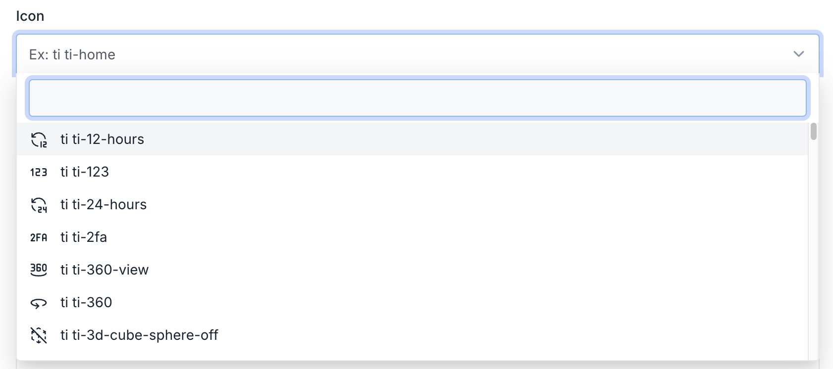
Customizing the Icon Field
You can customize the icon field using the CoreIconFieldOption class:
use Botble\Base\Forms\FieldOptions\CoreIconFieldOption;
use Botble\Base\Forms\Fields\CoreIconField;

$this->add(
    'icon',
    CoreIconField::class,
    CoreIconFieldOption::make()
        ->label('Custom Icon Label')
        ->help('Select an icon for this item')
        ->placeholder('Search for an icon...')
        ->defaultValue('ti ti-star')
);
Using in Theme Options
You can add an icon picker to your theme options using the IconField class:
use Botble\Theme\ThemeOption\Fields\IconField;

theme_option()
    ->setField([
        'id' => 'social_icon',
        'section_id' => 'opt-text-subsection-social',
        'type' => 'coreIcon',
        'label' => __('Icon'),
        'attributes' => [
            'name' => 'social_icon',
            'value' => null,
            'options' => [
                'class' => 'form-control',
            ],
        ],
    ]);
Using in Menu Items
Icons can be used in menu items. The menu system supports both icon fonts and icon images:
// In a menu node
$menuNode->icon_font = 'ti ti-home';
The menu system will automatically render the icon before the menu item text.
Checking for Icon Existence
You can check if an icon exists using the BaseHelper::hasIcon() method:
use Botble\Base\Facades\BaseHelper;

if (BaseHelper::hasIcon('ti ti-user-heart')) {
    // Icon exists
}
Or using the Icon facade:
use Botble\Icon\Facades\Icon;

if (Icon::has('user-heart')) {
    // Icon exists
}
Updating Available Icons
To update the list of available icons to the latest version from Tabler Icons, you can run the following command:
php artisan cms:icons:updateThis command will:
- Fetch the latest release of Tabler Icons from GitHub
- Download and extract the SVG files
- Copy the outline SVG icons to
platform/core/icon/resources/svg - Clean up the SVG files for optimal use
Custom Icon Drivers
The icon system supports custom drivers, allowing you to implement your own icon libraries:
use Botble\Icon\Facades\Icon;
use Botble\Icon\IconDriver;

class CustomIconDriver extends IconDriver
{
    public function all(): array
    {
        // Return all available icons
    }

    public function render(string $name, array $attributes = []): string
    {
        // Render an icon
    }

    public function has(string $name): bool
    {
        // Check if an icon exists
    }
}

// Register the custom driver
Icon::extend('custom', function ($app) {
    return new CustomIconDriver();
});

// Use the custom driver
Icon::driver('custom')->render('custom-icon');
Best Practices
Use Tabler Icons: Stick to Tabler Icons for consistency across the application.
Prefix Icons: Always use the
ti ti-prefix for Tabler Icons.Semantic Icons: Choose icons that clearly represent the action or concept they're associated with.
Accessibility: Ensure icons used for interactive elements have appropriate text labels or ARIA attributes.
Size Appropriately: Use the appropriate size for the context (e.g., smaller icons for dense UIs, larger icons for prominent actions).
Consistent Styling: Maintain consistent styling (color, size) for similar types of icons throughout your application.
Performance: The icon system is optimized for performance, but avoid rendering thousands of icons on a single page.