Widget Customization
The chat widget is a floating button that expands into a chat window on your frontend pages.
How It Works
When the plugin is active and enabled, the widget is automatically injected into your theme's footer. No theme code changes required.
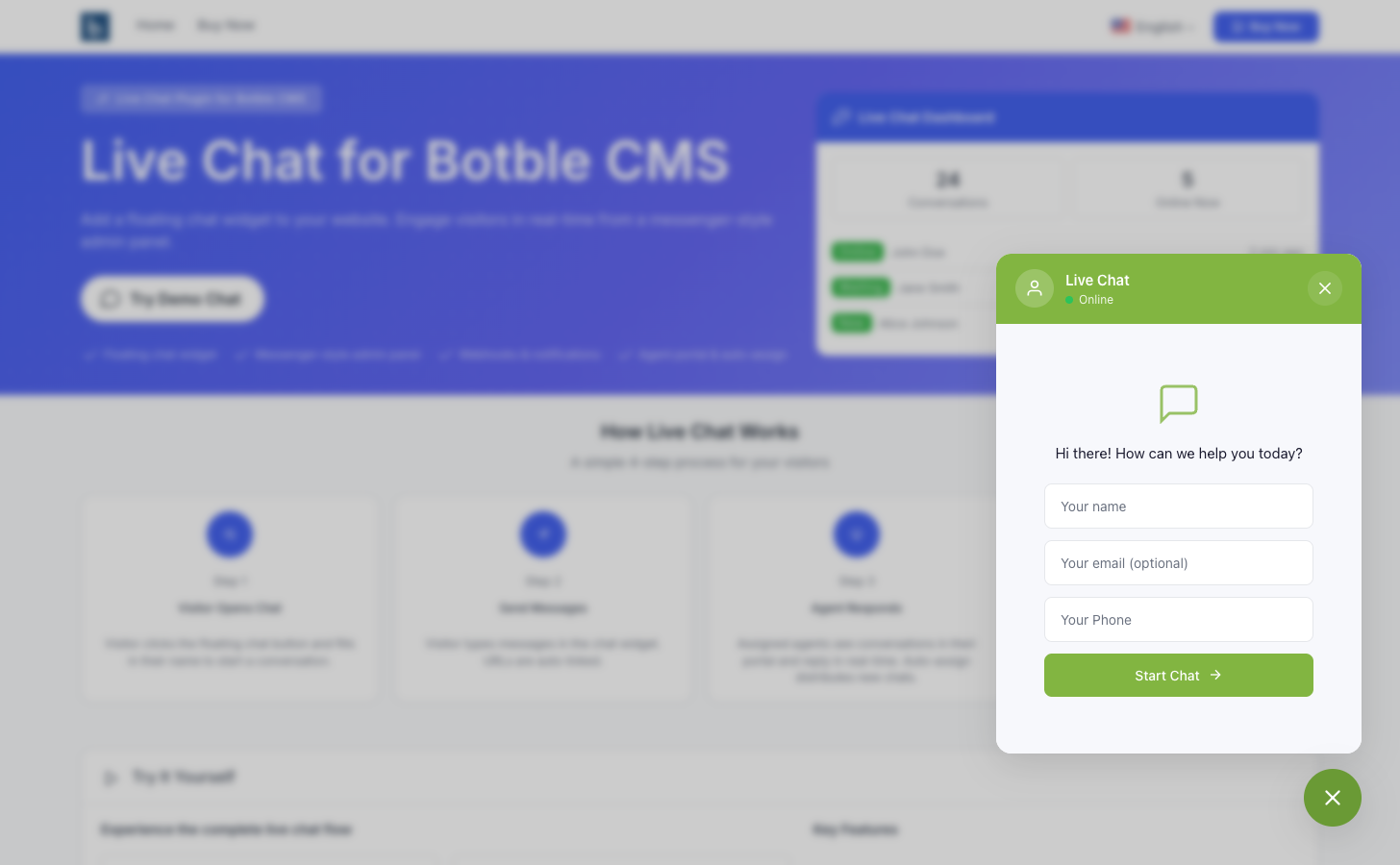
The widget consists of:
- Toggle button — Floating circular button with chat/close icons
- Chat window — Header, start form or message area, and input footer
Styling with CSS Variables
The widget uses CSS custom properties that you can override in your theme:
#live-chat-widget {
    --lc-primary: #5A5EB9;        /* Main color */
    --lc-primary-hover: #4a4ea0;  /* Hover color */
    --lc-status-color: #22c55e;   /* Online indicator color */
    --lc-offset-x: 20px;          /* Horizontal offset */
    --lc-offset-y: 20px;          /* Vertical offset */
}
These are set automatically from Settings, but you can override them via custom CSS in your theme.
Position Classes
The widget container gets a position class based on settings:
| Setting | CSS Class |
|---|---|
| Bottom Right | lc-position-bottom_right |
| Bottom Left | lc-position-bottom_left |
| Center Right | lc-position-center_right |
| Center Left | lc-position-center_left |
Mobile Visibility
When Hide on mobile is selected in settings, the widget gets the class lc-hidden-on-mobile which hides it on screens ≤768px.
Chat Flow
1. Start Form
When no active conversation exists, visitors see a form with:
- Name field (always required)
- Email field (if enabled)
- Phone field (if enabled)
- "Start Chat" button
2. Active Chat
After starting a conversation:
- Welcome message appears (if configured)
- Message area shows conversation history
- Input field with send button at the bottom
- Messages poll for updates at the configured interval
3. Session Persistence
The widget uses localStorage to remember active conversations. When a visitor returns to the site, their previous conversation is automatically restored with full message history.
Emoji Support
When Enable Emoji Conversion is turned on in Settings, text emoticons typed by visitors or admins are automatically rendered as emoji. For example, typing :) displays as 🙂 and :D as 😄.
This works in all three interfaces: the visitor widget, admin messenger, and agent portal. See Settings → Visual Effects for the full list of supported emoticons.
Keyboard Shortcuts
| Key | Action |
|---|---|
| Enter | Send message |
| Escape | Close chat window |